Pillsbury
Packaging, Branding, Design systems, illustration, motion design
An updated look to a traditional brand.
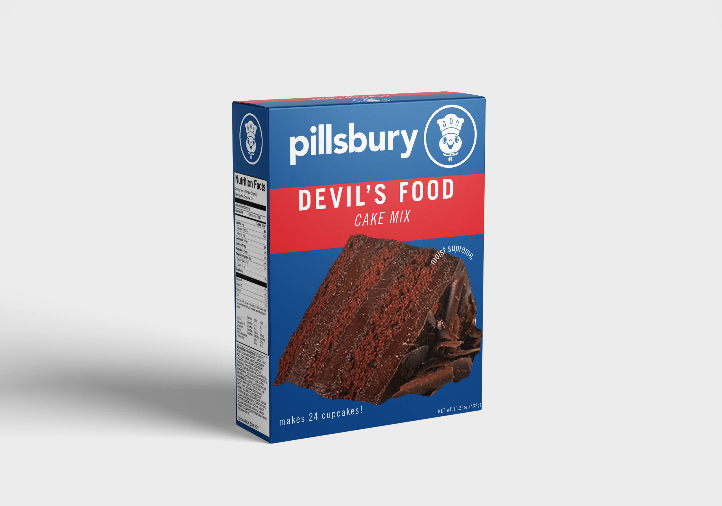
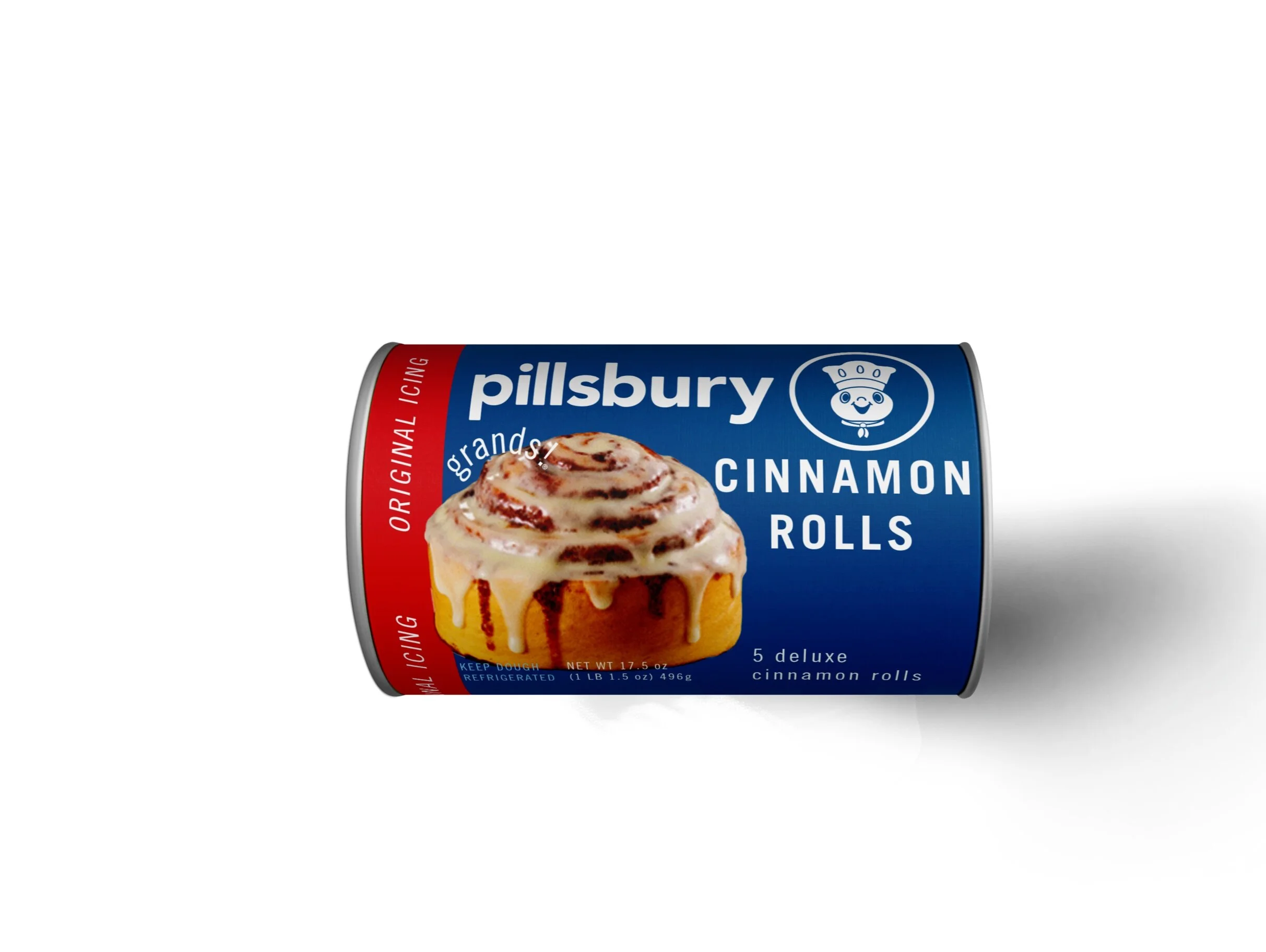
A Pillsbury cake birthday is my family’s tradition. With little to no change in their logo, I took it upon myself to refresh their look to stand against competition. After researching the brand, I came to find they were known for convenience, family values and a classic part of American grocery stores. I wanted to encompass those traits into their logo so it would speak on behalf of their values.
Finding the dough boy + Compositional studies
design elements + logo
Since Pillsbury is such a coveted staple in the American household I wanted to honor their history to the best of my ability. To do so I kept their circle emblem but added the Pillsbury dough boy to it. I used a sans-serif font to add a more modern look, as well as rounding out the original typeface to embody the casual, convenient and comforting characteristics that is Pillsbury. I did not entirely dispose of the original color palette but rather deepened or adjusted it to become more clean and polished.


