PILLSBURY
Personal Project
An updated look to a traditional brand.
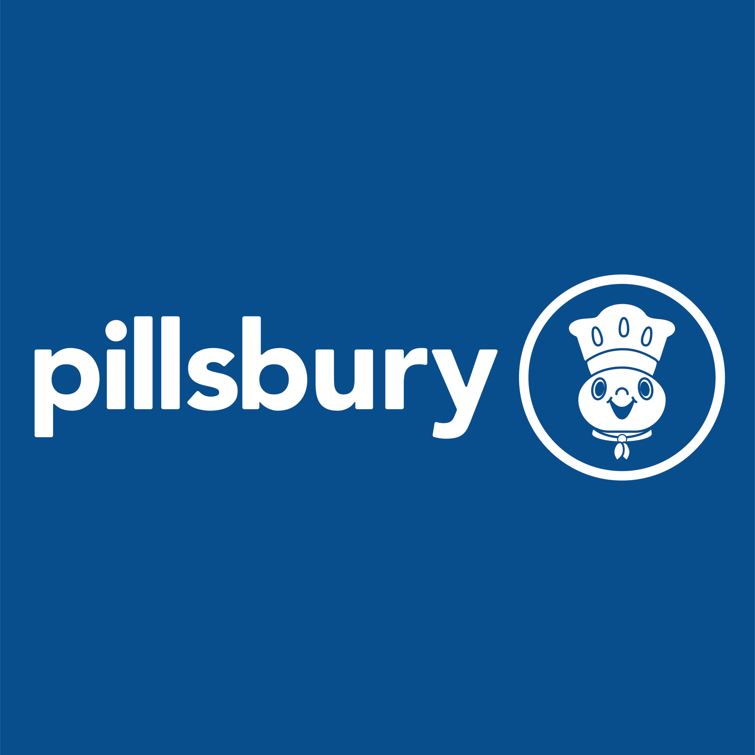
A Pillsbury cake birthday is my family’s tradition. With little to no change in their logo, I took it upon myself to refresh their look to stand against competition. After researching the brand, I came to find they were known for convenience, family values and a classic part of American grocery stores. I wanted to encompass those traits into their logo so it would speak on behalf of their values.
finding the dough boy
I chose to embody their token mascot, The Pillsbury Dough Boy, inside the logo to make him even more a face of the company. I revised him in a more cartoon light that would work well within a logo. Once I had my dough boy figured out I next took a run at composing the logo. I wanted that classic sticker of approval circle to come through the logo and I tested where and how to include that in.
compositional studies
Since Pillsbury is such a coveted staple in the American household I wanted to honor their history to the best of my ability. To do so I kept their circle emblem but added the Pillsbury dough boy to it. I used a sans-serif font to add a more modern look, as well as rounding out the original typeface to embody the casual, convenient and comforting characteristics that is Pillsbury. I did not entirely dispose of the original color palette but rather deepened or adjusted it to become more clean and polished.
final logo & design elements
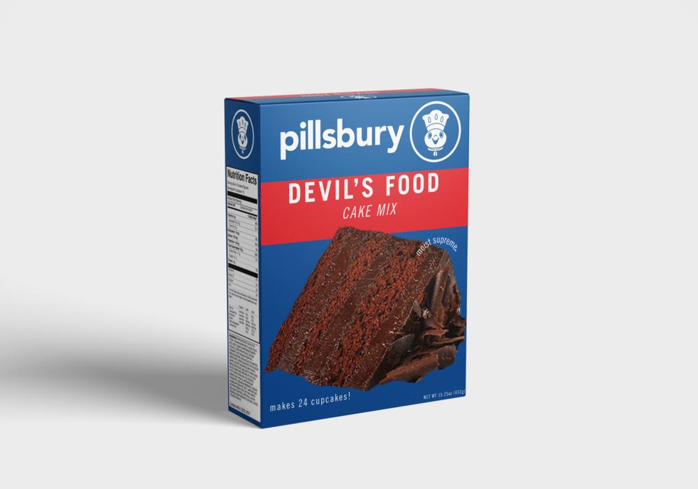
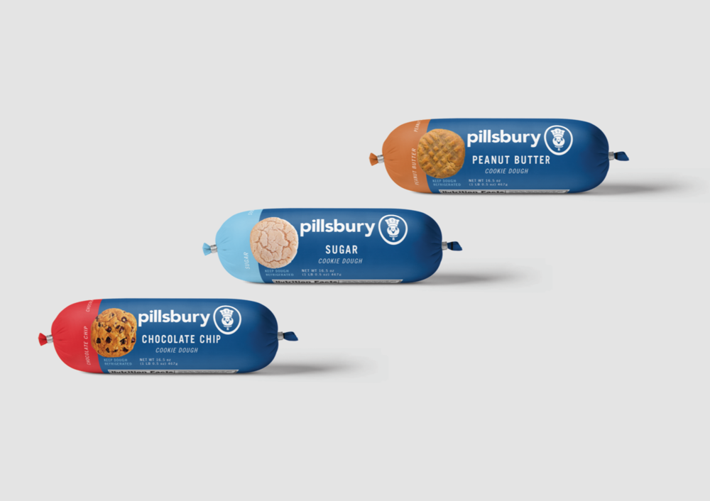
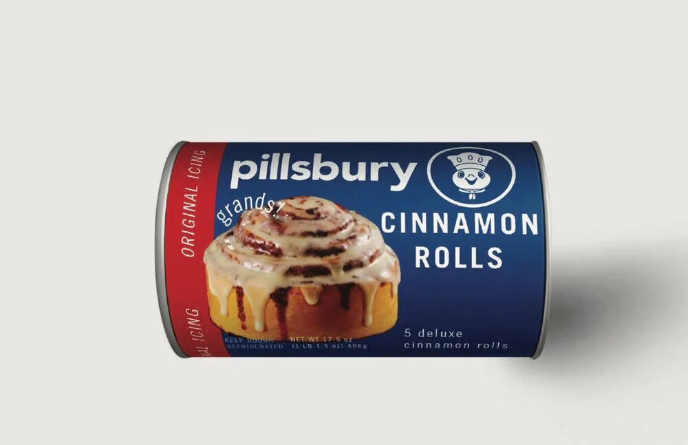
After refreshing the logo, I reimagined some of their existing products in the new style as well as GIF advertisements to fully apply this redesign realistically.


